

More people browse websites from smartphones than ever before. If your website looks great on a desktop but is difficult to use on a phone, you may be losing visitors, leads, and potential customers.
This is where mobile SEO becomes important.
Mobile SEO is the process of optimizing a website so that it works effectively on smartphones and other mobile devices while remaining easy for search engines to crawl, understand, and index.
A mobile-friendly website should have readable text, easy navigation, responsive layouts, fast loading times, accessible buttons, and content that works properly on smaller screens.
Google also uses the mobile version of a website’s content for indexing and ranking in its mobile-first indexing system. This means website owners should treat the mobile version of their site as a primary part of their SEO strategy.
In this guide, you will learn what mobile SEO is, why it matters, how mobile-first indexing works, the most important mobile optimization factors, common mistakes, and a practical checklist for improving your website.
What Is Mobile SEO?
Mobile SEO is the practice of optimizing a website for people who access it using smartphones and other mobile devices.
The goal is to provide a website experience that is:
- Easy to navigate
- Fast to load
- Simple to read
- Responsive across different screen sizes
- Easy to interact with
- Accessible to search engines
- Consistent with the desktop experience
Mobile SEO is not simply about making a desktop website smaller.
A good mobile experience requires thoughtful design and technical optimization.
For example, a navigation menu that works perfectly with a mouse may be frustrating on a small touchscreen. Similarly, a large desktop image can create unnecessary loading delays on a mobile connection.
Mobile optimization addresses these issues while helping search engines access and understand your content.
Why Is Mobile SEO Important?
Mobile SEO matters because users increasingly expect websites to work smoothly on smartphones.
Imagine someone searching for a local service while standing outside. They click your website, but the text is tiny, the navigation is difficult, and the page takes several seconds to load.
That visitor may leave and choose another business.
A technically strong mobile experience can therefore support both SEO and conversions.
1. Google Uses Mobile-First Indexing
Google predominantly uses the mobile version of website content for indexing.
This means your mobile website should contain the important content, links, structured data, and metadata that you want Google to understand.
You can learn more from Google’s official mobile-first indexing documentation.
2. Mobile Users Expect Fast Websites
Mobile users may browse using cellular connections and devices with different processing capabilities.
A heavy webpage can therefore create a poor experience.
This is one reason website performance should be included in your wider technical SEO strategy.
3. Mobile Usability Can Affect Conversions
SEO is not only about bringing visitors to your website.
Once someone arrives, they need to be able to read your content, navigate between pages, submit forms, call your business, or complete another desired action.
A poor mobile experience can create unnecessary friction.
4. Mobile Search Is Essential for Local Businesses
Mobile devices are particularly important for local searches.
Someone searching for a nearby SEO agency, restaurant, plumber, dentist, or other service may immediately visit a website from their phone.
A mobile-friendly website can make it easier for that visitor to find your phone number, location, services, reviews, and contact options.
For businesses targeting local customers, mobile optimization should therefore work alongside a broader SEO strategy.
What Is Mobile-First Indexing?
Mobile-first indexing means Google primarily uses the mobile version of a website’s content for indexing.
It does not mean Google has a separate mobile-first ranking system that automatically ranks mobile websites higher.
Instead, Google predominantly crawls and indexes the mobile version of pages.
This makes consistency between desktop and mobile versions extremely important.
For example, suppose your desktop website contains a detailed service description, FAQs, internal links, and important images, but your mobile version removes most of that content.
Google may primarily process the mobile version.
Therefore, hiding important content from mobile users can create SEO problems.
Mobile-First Indexing vs. Mobile-Friendly Ranking
These concepts are often confused.
Mobile-first indexing concerns which version of a website Google primarily uses for indexing.
Mobile-friendly design concerns how effectively a website works for users on mobile devices.
A website can technically be included in mobile-first indexing while still providing a poor mobile experience.
Your goal should be to address both technical accessibility and user experience.
How to Make a Website Mobile-Friendly
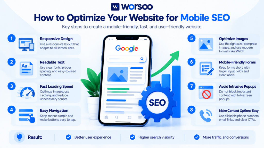
A mobile-friendly website should automatically adapt to different screen sizes.
Here are the most important areas to review.
1. Use Responsive Web Design
Responsive design allows the website layout to adapt according to the visitor’s screen size.
Instead of creating completely separate desktop and mobile websites, a responsive website can rearrange elements based on available screen space.
For example:
Desktop:
- Navigation appears horizontally.
- Multiple columns display side by side.
- Large images occupy wider sections.
Mobile:
- Navigation becomes a mobile menu.
- Columns stack vertically.
- Images resize to fit the screen.
Responsive design is generally the simplest approach for maintaining consistent content across devices.
2. Make Text Easy to Read
Visitors should not have to zoom in to read your content.
Check:
- Font size
- Line spacing
- Paragraph width
- Heading size
- Contrast
- Button labels
Long paragraphs can also become difficult to read on small screens.
Break complicated sections into shorter paragraphs and useful subheadings.
This improves readability for both mobile and desktop visitors.
3. Make Buttons Easy to Tap
Mobile visitors use fingers instead of a mouse.
Buttons and links therefore need enough space around them to reduce accidental clicks.
Pay particular attention to:
- Navigation links
- Contact buttons
- Form fields
- CTA buttons
- Phone numbers
- Dropdown menus
A visitor should be able to tap an element without accidentally activating another nearby element.
4. Optimize Images
Large images can significantly increase page weight.
Before uploading an image:
- Resize it to an appropriate display size.
- Compress it.
- Use modern image formats when appropriate.
- Avoid uploading unnecessarily large files.
- Use descriptive filenames and alt text.
Image optimization can also help with the loading performance metrics discussed in our guide to Core Web Vitals.
5. Improve Mobile Page Speed
Mobile SEO and website performance are closely connected.
A page that loads slowly can frustrate users before they even see the main content.
Review:
- Server response time
- Image sizes
- JavaScript
- CSS
- Third-party scripts
- Caching
- Redirects
- Unused resources
You can test individual pages using Google PageSpeed Insights.
PageSpeed Insights can provide performance information and recommendations that help identify potential optimization opportunities.
6. Avoid Intrusive Popups
Popups can be particularly frustrating on mobile devices because the screen is smaller.
A popup that covers the entire screen can make it difficult for visitors to access the content they were looking for.
If you use popups, make sure they are easy to close and do not unnecessarily interfere with the visitor’s ability to access the main content.
Google also provides guidance about intrusive interstitials and their impact on the user experience.
7. Make Navigation Simple
Mobile navigation should help users find important pages quickly.
Avoid unnecessarily complicated menus with many nested levels.
A typical business website might include:
- Home
- Services
- About
- Blog
- Contact
Depending on the website, additional categories may be appropriate.
The important thing is to make the navigation logical and easy to use.
A strong navigation system also supports internal linking and helps search engines discover important pages.
8. Keep Important Content Available on Mobile
Do not remove important information simply because the screen is smaller.
Your mobile page should provide the essential content users need.
This includes:
- Main headings
- Service descriptions
- Important links
- Product information
- FAQs
- Relevant images
- Structured data
- Contact information
If significant content exists only on the desktop version, review whether that creates an SEO problem.
9. Check Your Forms
Forms are often overlooked during mobile optimization.
A form that is easy to complete on a desktop may be frustrating on a smartphone.
Check:
- Input field size
- Label clarity
- Keyboard behavior
- Number fields
- Required fields
- Error messages
- Submit buttons
Keep forms as short as possible while still collecting the information your business actually needs.
10. Make Phone Numbers Clickable
For businesses that receive phone calls, mobile users should be able to tap the phone number rather than manually copy it.
For example, instead of displaying a phone number as plain text only, make it a clickable telephone link.
This small usability improvement can make it easier for mobile visitors to contact the business.
Mobile SEO and Core Web Vitals
Mobile SEO is closely connected with website performance.
Core Web Vitals measure important aspects of real-world user experience.
The three primary metrics are:
| Metric | What It Measures |
|---|---|
| LCP | Loading performance |
| INP | Responsiveness |
| CLS | Visual stability |
A mobile page may have excellent content but still provide a frustrating experience if its main content loads slowly, buttons respond slowly, or elements jump around unexpectedly.
That is why performance should be considered alongside mobile design.
Our Core Web Vitals SEO guide explains these performance metrics in more detail.
How to Test Mobile SEO
You can use several tools to identify mobile SEO problems.
Google Search Console
Google Search Console can help you monitor search performance, indexing, and technical issues.
Use it to investigate important URLs and understand how Google processes your website.
PageSpeed Insights
PageSpeed Insights provides performance measurements and diagnostics for individual URLs.
Test both your homepage and important internal pages.
A website may have a fast homepage but slow service pages because of different images, scripts, or page templates.
Browser Developer Tools
Modern browsers provide responsive design tools that allow developers to simulate different screen sizes.
Test common smartphone dimensions and inspect how the layout changes.
Real Mobile Devices
Testing on an actual smartphone is also valuable.
A website may look acceptable in a desktop simulator but feel different when navigating with a real touchscreen.
Test:
- Menus
- Forms
- Buttons
- Images
- Scrolling
- Contact links
- Popups
- Page loading
Common Mobile SEO Mistakes
Mistake 1: Designing Only for Desktop
A website can look impressive on a large monitor but fail on a smartphone.
Always review your designs at smaller screen sizes.
Mistake 2: Using Huge Images
Large images can increase page weight and slow down mobile loading.
Optimize images before uploading them.
Mistake 3: Tiny Text
Visitors should not need to zoom in to read your content.
Use readable typography and appropriate spacing.
Mistake 4: Small Buttons
Tiny buttons and closely positioned links can be difficult to tap.
Give interactive elements sufficient space.
Mistake 5: Blocking Important Content
Do not hide important content from mobile visitors simply to create a cleaner design.
Your mobile page should still provide the information required to understand the topic or service.
Mistake 6: Ignoring Mobile Forms
A broken or difficult form can turn an interested visitor into a lost lead.
Always test your contact and quote forms on an actual smartphone.
Mistake 7: Too Many Popups
Multiple popups can interrupt the visitor and make navigation frustrating.
Use them carefully and make them easy to close.
Mistake 8: Forgetting Internal Links
Mobile pages should still provide useful paths to related content.
For example, an article about mobile SEO can link to a relevant guide about SEO keywords and a resource explaining search intent in SEO.
Internal links help visitors discover related information while creating useful connections between pages.
Mobile SEO Checklist
Use this checklist when reviewing a website.
Design
- Website uses responsive design
- Text is easy to read on mobile
- Navigation is simple
- Buttons are easy to tap
- Content fits the screen
- Images resize correctly
- No horizontal scrolling is required
Performance
- Images are optimized
- Unnecessary scripts are removed
- CSS is optimized
- Browser caching is configured appropriately
- Server response times are acceptable
- Core Web Vitals are monitored
- Important pages are tested with PageSpeed Insights
SEO
- Important content is available on mobile
- Mobile and desktop content are consistent
- Internal links work correctly
- Canonical tags are correct
- Structured data is implemented appropriately
- Important pages can be crawled
- XML sitemap is accurate
User Experience
- Forms work on smartphones
- Phone numbers are clickable
- Popups do not obstruct important content
- Menus are easy to operate
- Contact information is easy to find
- Users can complete important actions without zooming
Mobile SEO and Internal Linking
Internal linking is an important part of a complete SEO strategy, including mobile optimization.
When users visit an article on a smartphone, relevant internal links can guide them toward additional resources.
For example, a technical SEO article can link to your guide about backlink profiles when discussing off-page SEO.
Similarly, readers interested in link building can learn more through your link building guide.
The goal is not to add as many links as possible.
Instead, links should be relevant and useful.
A good internal linking strategy creates a logical relationship between related pages and makes it easier for visitors to continue exploring your website.
Does Mobile SEO Improve Google Rankings?
Mobile SEO can support search performance, but there is no single optimization that guarantees higher rankings.
Google considers many factors when determining search results.
These can include relevance, content quality, technical accessibility, page experience, links, and other signals.
Mobile optimization is therefore best viewed as part of a broader SEO strategy rather than a shortcut to higher rankings.
For example, making a website responsive will not automatically make a poorly written article rank first.
However, if your website is difficult to use on mobile devices, improving the experience can remove an unnecessary obstacle for both users and search engines.
Frequently Asked Questions About Mobile SEO
What is mobile SEO?
Mobile SEO is the process of optimizing a website so that it provides a strong experience on smartphones and other mobile devices while remaining accessible to search engines.
Why is mobile SEO important?
Mobile SEO is important because many users access websites through smartphones. A mobile-friendly website can make content easier to read, navigation easier to use, and important actions easier to complete.
What is mobile-first indexing?
Mobile-first indexing means Google predominantly uses the mobile version of a website’s content for indexing.
Is mobile SEO a ranking factor?
Mobile-related experience and page experience are considered within Google’s broader search systems, but no single mobile optimization guarantees higher rankings.
How can I check if my website is mobile-friendly?
Test your pages on real smartphones, use browser responsive tools, review Search Console, and use PageSpeed Insights to investigate performance.
Does responsive design help SEO?
Responsive design can make it easier to maintain consistent content and functionality across devices. It can also provide a better user experience, which supports a technically sound SEO strategy.
Can a slow mobile website hurt SEO?
Poor performance can create a bad user experience and may affect page experience signals. However, rankings depend on many factors, so improving speed alone does not guarantee higher rankings.
Should mobile and desktop websites have the same content?
Important content should generally be consistent across mobile and desktop versions, particularly because Google predominantly uses the mobile version for indexing.
Improve Your Website’s Mobile SEO With Worsoo
A mobile-friendly website is no longer something businesses should treat as an optional design feature.
Your website needs to be easy to navigate, fast enough to use comfortably, technically accessible, and capable of delivering important content across different screen sizes.
Worsoo helps businesses improve their online visibility through technical SEO, content optimization, and strategic website improvements.
Explore Worsoo’s SEO services to see how technical optimization can fit into your broader search strategy.
If you want to identify mobile SEO and technical issues affecting your website, contact Worsoo to discuss your goals.
Final Thoughts
Mobile SEO is about creating a website that works well for both mobile users and search engines.
Start with the fundamentals: responsive design, readable content, simple navigation, optimized images, fast loading, accessible forms, and consistent mobile content.
Then use Google Search Console, PageSpeed Insights, and real-device testing to identify areas that need improvement.
Mobile SEO should not be treated as a one-time task. Websites change constantly as new pages, plugins, images, scripts, and design elements are added.
Regular testing helps ensure that your website continues to provide a strong experience for mobile visitors while maintaining a solid technical foundation for organic search.
A website that is easy to use on a smartphone is better positioned to turn mobile search visitors into engaged users and potential customers.